Portfolio
Over the past 15+ years, I've worked on projects of almost every size and in almost every industry. These are a few of them.
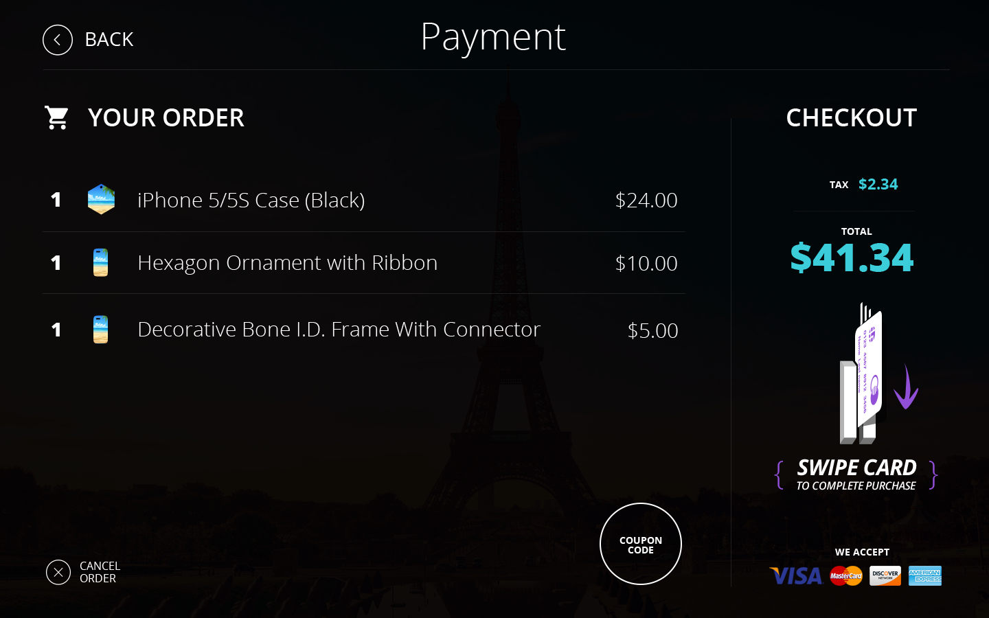
Keepsake Kiosk
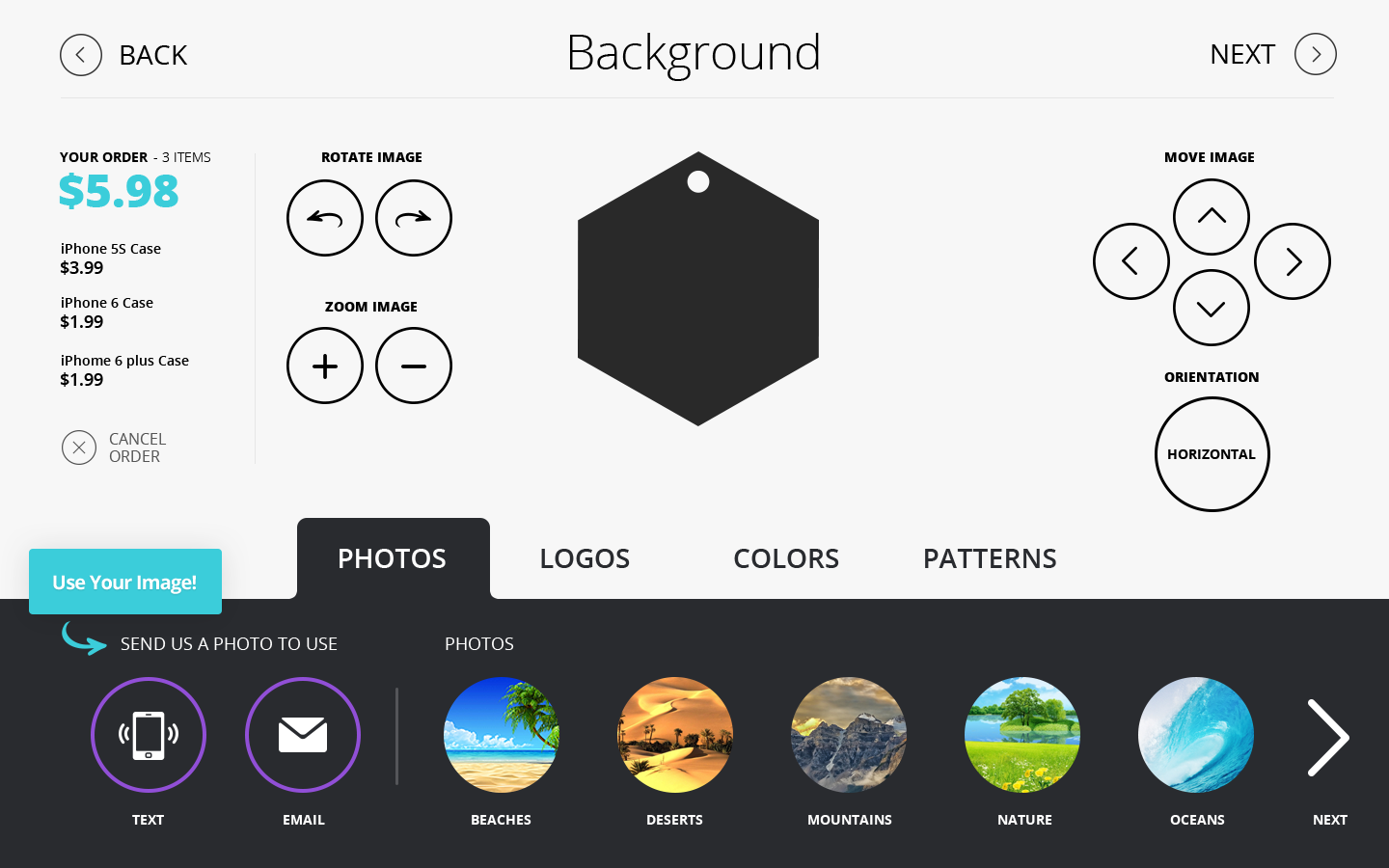
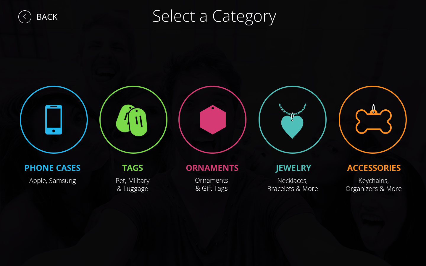
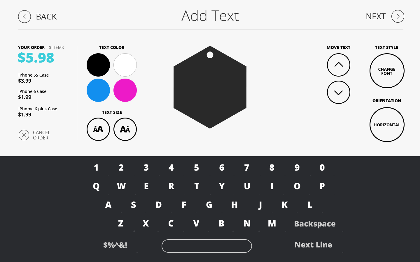
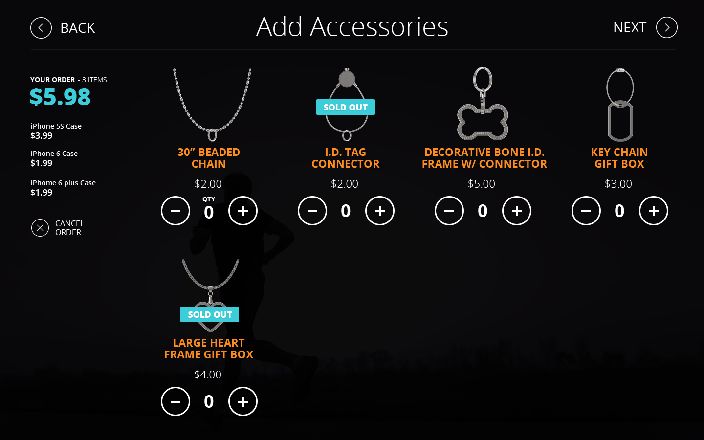
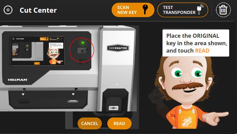
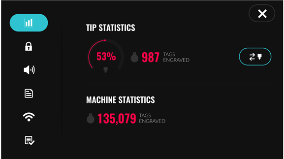
We designed three separate projects for this client. This project, which was an innovative keepsake kiosk, is one of my very favorite projects. The idea was innovative and the design for the UI and the simplicity of the workflow that we created made this an amazing product. Other projects we did for the same client include a key cutting and duplication kiosk UI that was used in Home Depot, Lowe's and Ace Hardware stores. The other was a pet chain engraving kiosk that was used at Pet co and Petsmart.
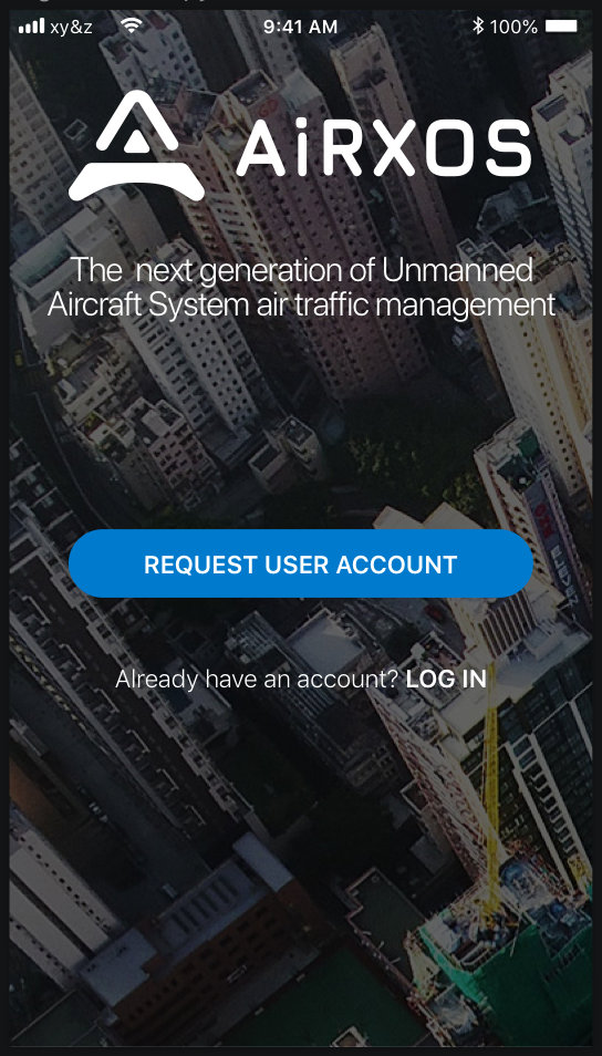
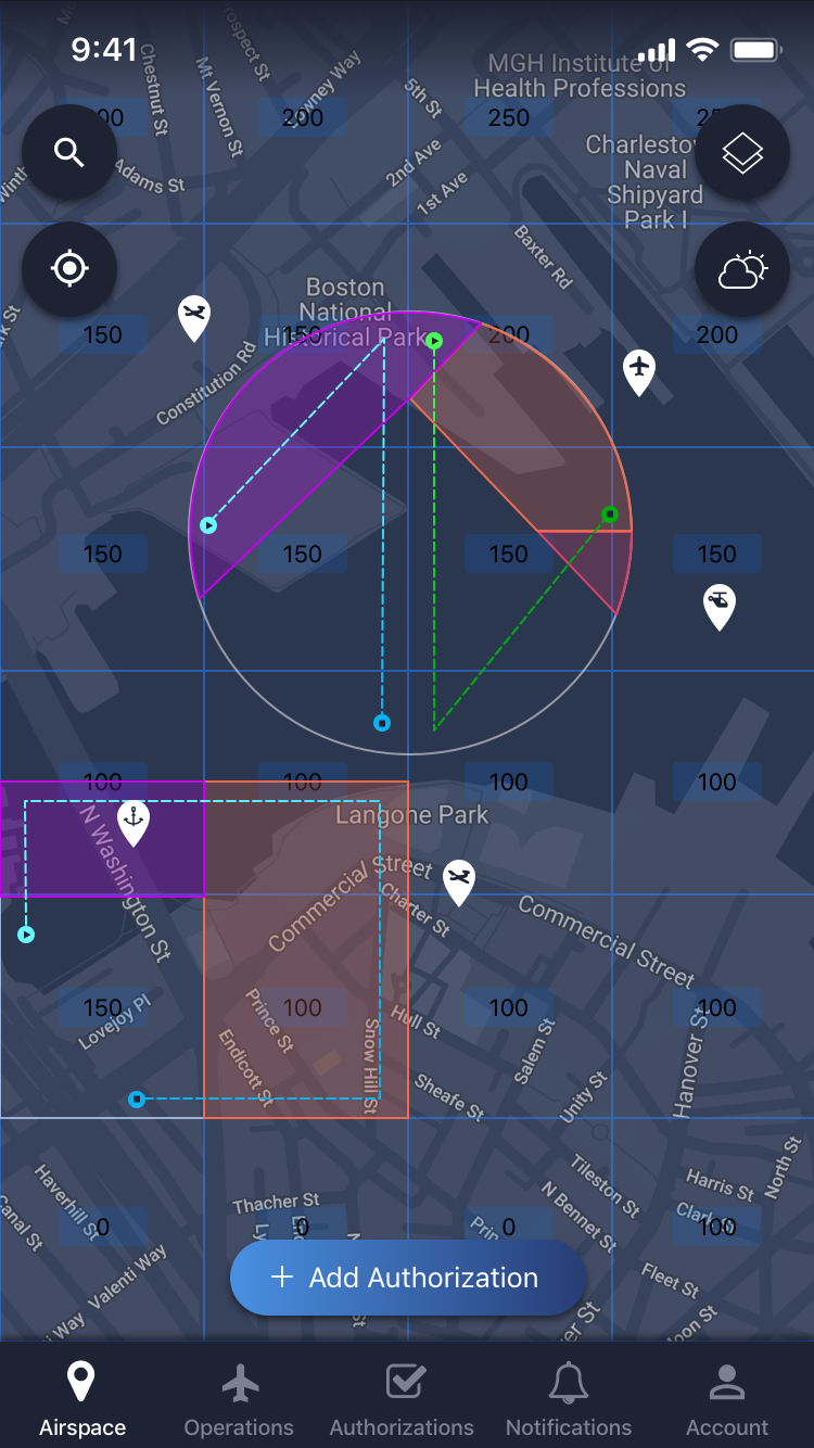
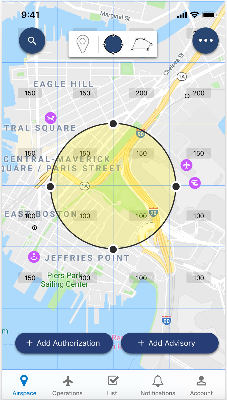
FAA Flight Authorization for GE
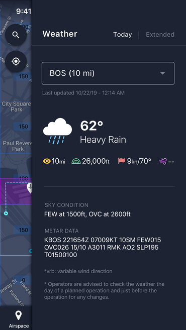
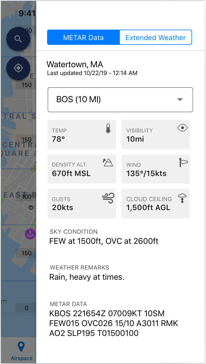
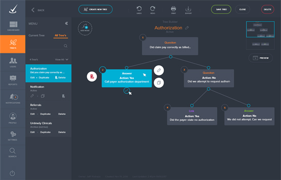
The Federal Aviation Administration (FAA) requires that commercial aircraft, be authorized to fly at certain times and in certain locations. The safety of everyone in the air is at stake. With the GE Airox app, users can request and receive this authorization as quickly and easily as possible. Our task, as User Experience Designers was to create a user experience and interface that made the complexity of federal air restrictions and FAA authorization easy to understand and manage.
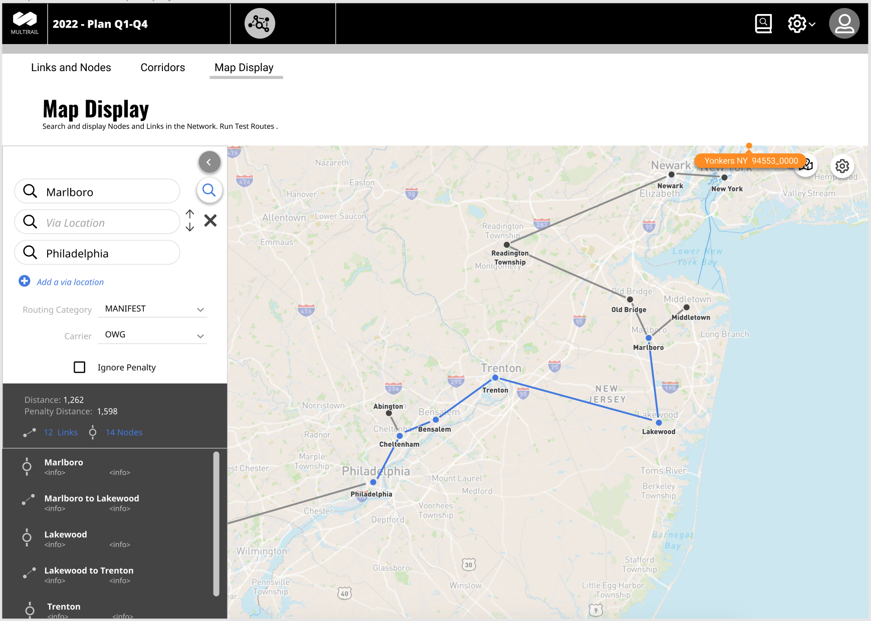
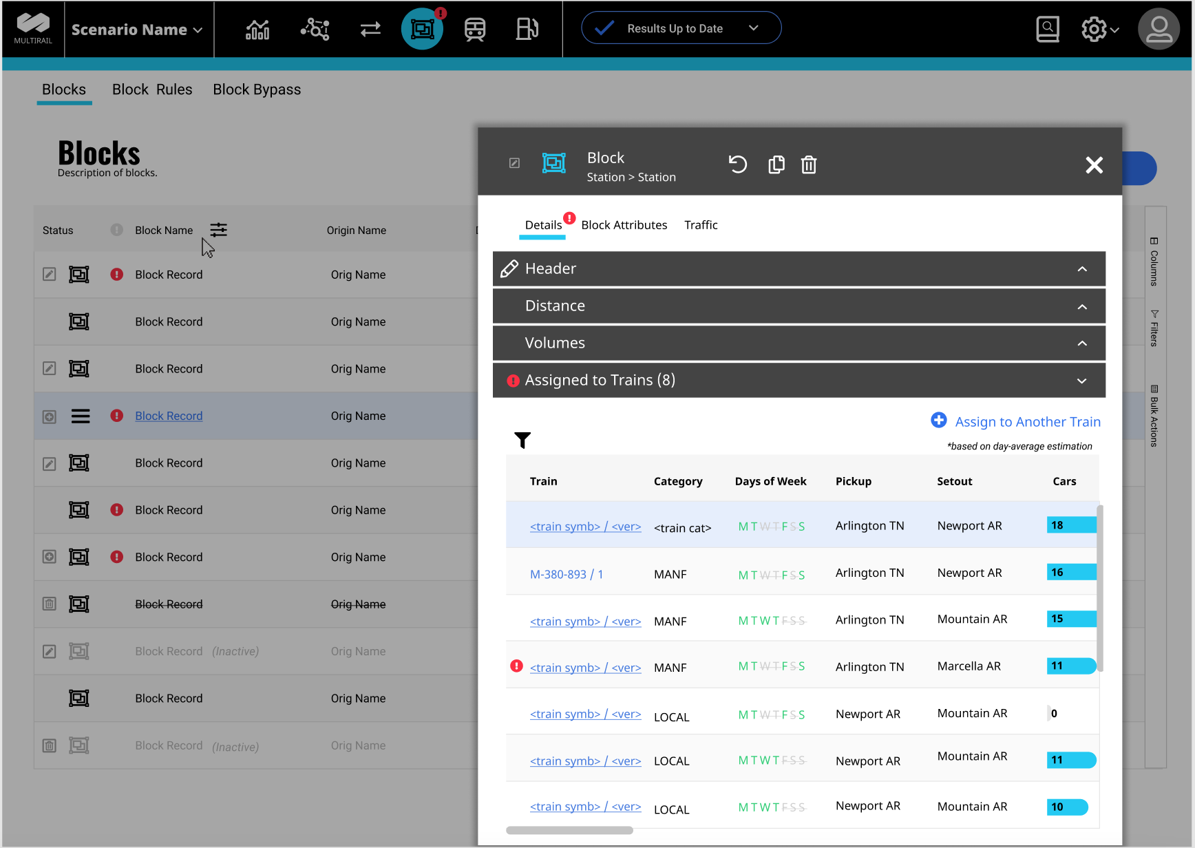
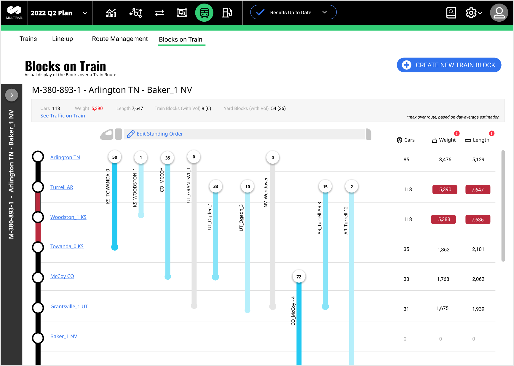
Railroad Planner Desktop Application
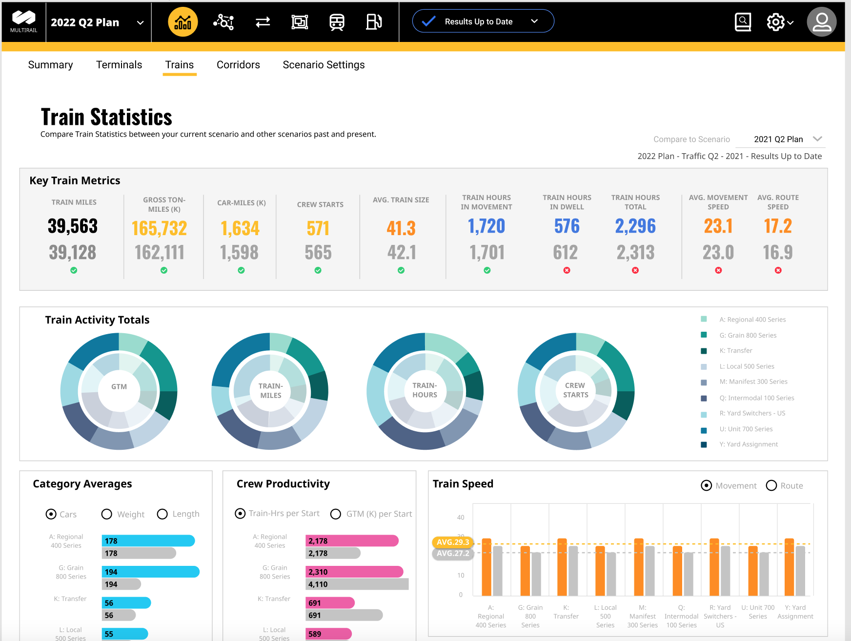
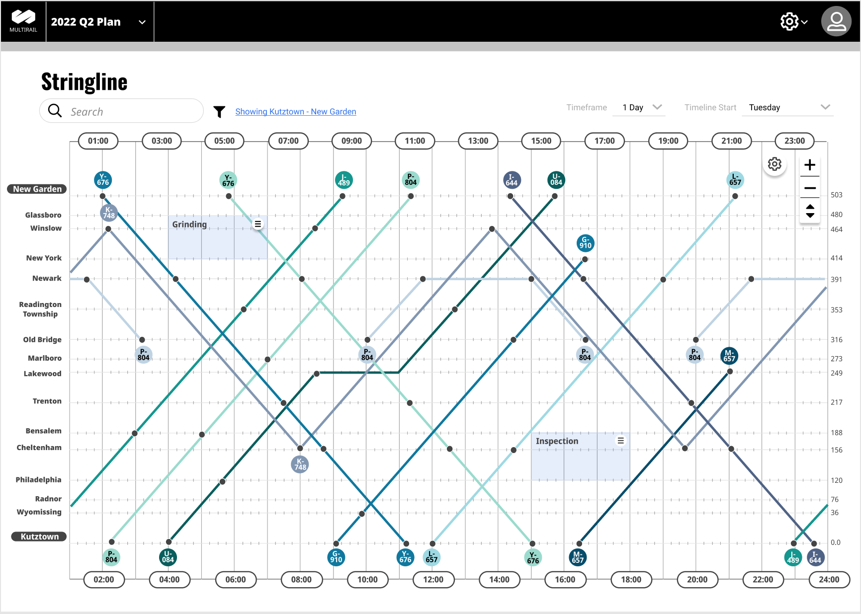
Planning for the operation of a railroad is extremely complex. The scale of the task along with the all of moving parts makes for long hours spent making sure everything is going where it should. I helped Oliver Wyman update their Service Planner application to a modern user interface and added some amazing bells and whistles along the way. This was a multi-year project that used an international team of Product Owners, Users, Executive Stakeholders and the Product team. To-date, this was the most seamless and well run project I've been a part of. We delivered an amazing design that scored extremely high with the user testing, on-time and on-budget.
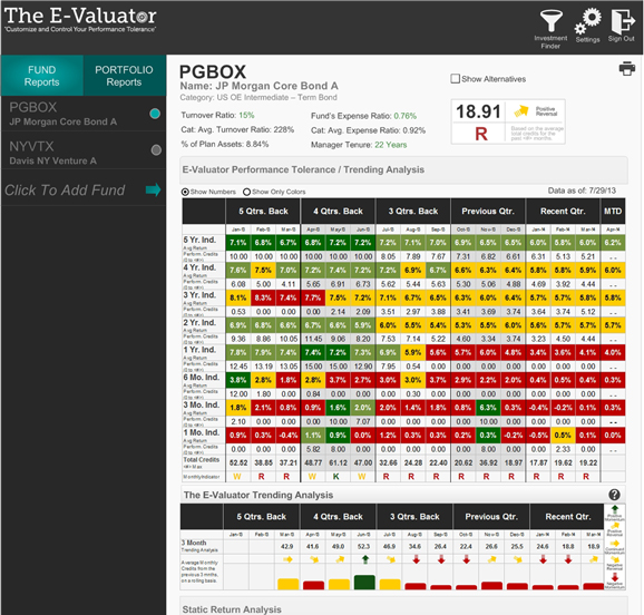
Investment Fund Manager
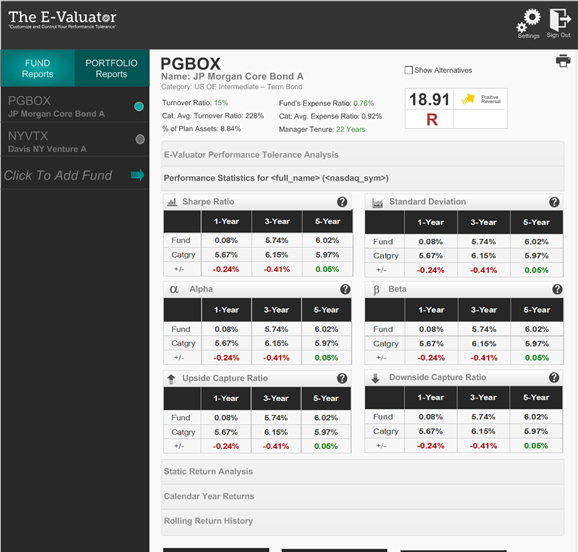
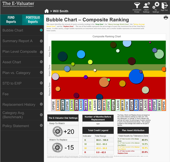
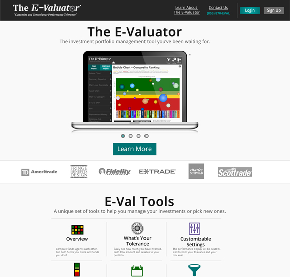
The E-Valuator is a tool that I designed for a client who was a financial advisor. He had a concept for giving investors a view into how a fund was doing based on their level of risk tolerance. The application required numerous integrations with stock results as well as user based input. One of the most difficult parts was to give the user all of the historical performance data without creating a high cognitive load. We used colors and weight to keep things as simple as possible. I designed not only the SaaS application, but their marketing site and much of their branding.
Time and Asset Tracking
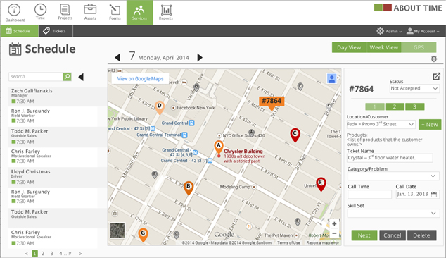
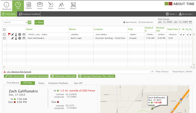
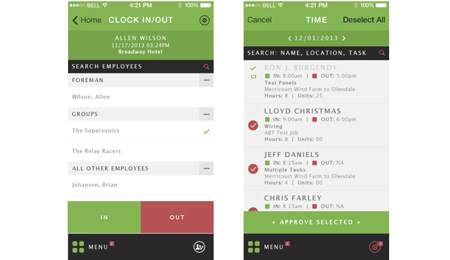
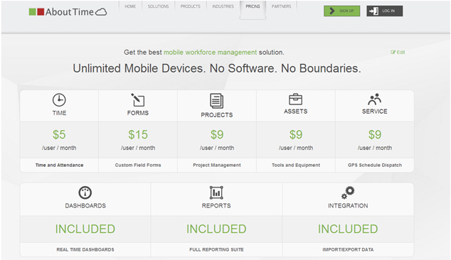
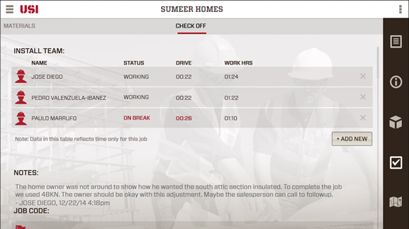
I was the principal designer for a remote Time and Asset tracking application. This was a multi-year project that involved 4 different designers including myself. We designed a desktop application for managing the backend, a mobile app for entering time when on a job site, a shopping cart for payment and upgrades, an analytics engine for executives and even a marketing site that connected to everything. We were very careful to maintain consistency and adherence to branding and design guidelines. The result was a world class, end-to-end time tracking and asset management solution.
Augmented Reality Social Media Platform
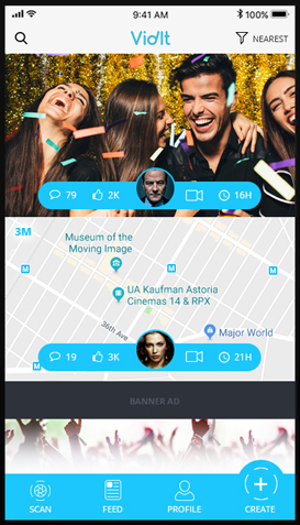
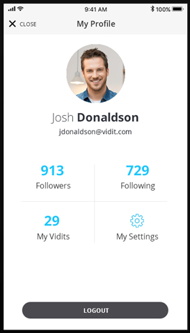
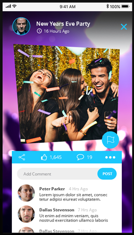
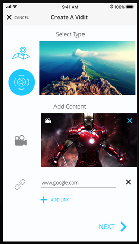
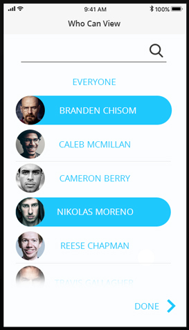
The Vidit project was an augmented reality social media application for mobile. We did hours of user research to determine user behavior and target markets. The design reflects the simple and clean feeling that we wanted to portray. Myself and another designer worked constantly with the engineering team to make sure the vision was reflected in the live application.
Other Kiosk and Tablet Designs
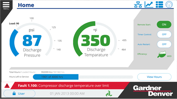
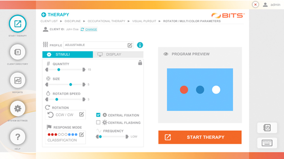
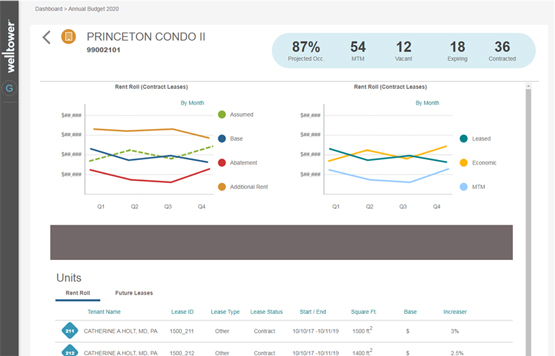
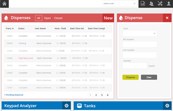
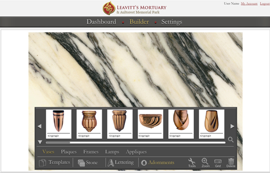
I love the challenge of designing within the limitations of a kiosk or tablet. Having to think not only about the workflow and presentation, but the physical environment in which the screen is placed. One of my favorite things about being a designer is the challenge of thinking through extremely complex problems and creating elegant solutions.
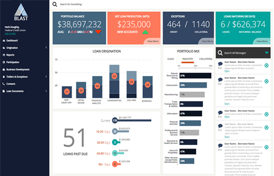
Other Desktop Applications and Sites
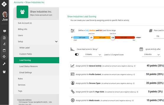
I've designed dozens of applications where we determined the user base was entirely desktop or laptop. These can be both public access or internal access applications. These present their own challenges. User research determines the ideal screen size for the user base as well as the target browser. And they almost always need to be designed using a standardized grid layout. Because of the added space, keeping things simple and elegant is one of my top priorities.
